 | ||||||||||||
|
2400 Works. 215 Exhibitors. Explore the Fair.
| ||||||||||||
| ||||||||||||
| ||||||||||||
|
Works from the fair available for online sale before the fair opens
| ||||||||||||
| ||||||||||||
Go to The Armory Show
|
Thursday, February 28, 2013
ARTSY


Thursday, February 21, 2013
Ross Bown's Notes On Complementary Colors
Basics: Complementary Colors
Complementary Color
 |
| Primary colors and their compliments |
 |
| Complementary Colors |
Two colors are complementary to each other if when mixed together in equal amounts the resulting color is a neutral gray. As I mentioned before the complement to a primary color is a secondary color, the secondary color is made up of the other two primary colors. For example, the compliment of red is green, which is a mixture of yellow and blue. The other compliments to the primary colors are; orange complements blue and purple complements yellow.
But the complementary relationship doesn't apply only to the primary and secondary colors. Any two colors mixed together that create a neutral gray are considered complimentary colors.
How to find the Complimentary Color...
To figure out which colors are complementary the color wheel becomes very useful. The colors that are directly opposite of each other on the color wheel are the compliments of each other. That is to say, if you were to draw a line from one color through the central axis of the wheel to another color you will find the color that is complementary to your chosen color. You can do this with any color on the wheel.
 |
| Finding the complementary colors on the color wheel |
What makes Complimentary Colors Useful
On reason complementary colors are useful is the knowledge that when mixing the two compliments equally you will end up with a neutral gray. This tells us that if we mix the two colors in differing amounts we are making colors that are moving closer and closer to gray. This is one way of muting colors or lessening the intensity of a pure color. The chart below illustrates the gradual progression mixing varying amounts of the two compliments together, in this case red and green. Mixing a little green with red reduces the intensity of the color. The same applies to the other side, adding a little red to the green calms the color's intensity. Continuing the process, gradually mixing more and more equal amounts of each color together you will neutralize the both colors and eventually have gray.
 |
| Mixing complementary colors |
There is much more that is useful about working with complimentary colors. Complementary colors have a dynamic relationship and can be used to create balance or tension. Many artists use complementary color schemes as a guide their painting.
Wednesday, February 20, 2013
Adrian Gottlieb's Verdaccio Technique
Adrian Gottlieb's Verdaccio Technique
 |
| Anticipation oil on belgian linen 26 X 20 inches |
California-based artist Adrian Gottlieb has always been gracious in sharing his knowledge of painting. His original website was filled with information he had amassed during his period of study at the Florence Academy of Art, and included recipes and procedures for making higher-quality and more archivally-sound materials than were then commonly available on the market. For those seeking education in traditional painting techniques, his website was a treasure trove of instruction (much of this information has now been transferred to the website dedicated to Gottlieb's Atelier).
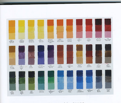
In October of 2010, Gottlieb further shared his methods in an article which appeared in The Artist's Magazine. Written by Daniel Brown, the article focussed on Gottlieb's verdaccio technique, and also explored the artist's feelings behind the psychology of the painted portrait. Portions of the article were reprinted online at the Artist's Network, and the following excerpts are from that site.

1. "After I do a drawing and color study, I draw in paint, working on top of a warmimprimatura (first layer, the underpainting) that is closest to burnt umber in color and actually rather dark in value. I try for the color/value of the imprimatura to be the approximate color/value of the shadows of my main subject. When the imprimatura is fully dried, I draw in a similar color."
(For this demonstration, Gottlieb used a heavy linen canvas primed with five layers of acrylic gesso.)
imprimatura - Italian for first paint layer; the initial stain of color painted on a ground and left visible in areas over subsequent transparent layers; usually made with an earth color like burnt umber.

2. "In this step I build up the piambura, or white base, thinly so that the finished painting will have a luminous and translucent effect. It’s important that I create a good value relationship and blueprint of the form right from the beginning."
(Gottlieb uses mongoose and bristle filbert brushes from Rosemary & Co.. His medium is a mixture of sun-thickened oil and Canadian balsam. For oiling out, he uses copal retouch varnish.)
piambura - the lead white base that gives faces their luminosity.

3. "The Verdaccio technique, which uses a verdaccio layer is particularly advantageous for a bright figure against a relatively dark background. I fully model the forms, using temperature variations (cool and warm) between blue-greens and reds. I keep the painting too light (in value) so when I glaze the piece, the tone will fall back down."
(For the verdaccio technique, Gottlieb recommends his students use Sinopia and Chrome Oxide Green from Blue Ridge Oil Colors. He also suggests using permanent rose from Winsor & Newton, and Indian yellow from Schmincke Mussini.)
verdaccio - is a style of underpainting, which uses green-grey colours to establish values for later layers of paint. The technique is renowned for being particularly effective when painting flesh tones. As such, it was popular amongst Renaissance artists, and Leonardo da Vinci used verdaccio underpainting in his masterpiece, the Mona Lisa.
 |
| Portrait of Gregg oil, 26 X 20 in. |
4. "You can see the results of the primary and secondary glazes, executed in thin layers, using lakes of color that are similar in degree of transparency and tint. I then apply straight color to work out the exact color notes and establish the relationship between figure and ground in Portrait of Gregg (oil, 26×20)."
(On his personal website, Gottlieb lists his color palette as the following colors: lead white, lead tin yellow, yellow ochre, vermilion, transparent red oxide, pyrol ruby red, cobalt blue, transparent sepia, olive green, and ivory black. When mixing his colors, Gottlieb limits the number of source colors to four or less, and never mixes his colors directly on the canvas. The student materials list on Gottlieb's Atelier website goes into much greater detail.)
---------------------------------------------
The piambura stage of Gottlieb's paintings shows the tonal sensitivity the artist has, and are so beautiful, that many of his portraits are left at this level of finish.
 |
| Piambura of Danni oil on Belgian linen 20 X 16 in. |
 |
| Piambura of Heather #3 oil on Belgian linen 20 X 16 in. |
 |
| Piambura of Heather #1 oil on Belgian linen 20 X 16 in. |
 |
| Piambura of Heather #2 oil on Belgian linen 20 X 16 in. |
 |
| Piambura of Heather #4 oil on Belgian linen 20 X 16 in. |
 |
| Piambura of Heather #5 oil on Belgian linen 20 X 16 in. *(Taken from www.underpaintings.blogspot.com) |
Thursday, February 14, 2013
Landscape Goodness
Here is some contemporary landscape eye candy for you to enjoy.


Patricia Schaefer (Click the Link)

John David Wissler (Click the Link)
"Interviewer: You got your MFA from the Parsons School of Design and have studied with an impressive list of painters including Leland Bell, Paul Resika, and Larry Rivers. Please tell us something about your evolution as a painter and what has lead you to become the painter you are today.
JDW: First, I want to thank you for asking me to do this interview with you Larry, I am honored.
This is a great question! Early on, I was a bit of a perfectionist (perhaps the poster child). I wanted to be in control of it all. I drew and rendered everything, seeing all the details as important and painted some very pleasing, pretty, dead paintings! My high school art teacher, Faith Lang, and later my friend, professor and artist George Sorrels, opened the door for me to see great painting. This was the beginning of painting for me. In Claude, Corot, Inness, Cezanne, and Matisse, I saw moving spaces, full of air! Color that moved my eye, that took chances and was never static. I realized I was not happy painting how I was taught. I needed to begin to move the paint, free myself from the rules. Explore; push myself to move beyond what was comfortable to me, to see! I began to consider building and creating the tension between shape and color, Opening the picture plain in a dynamic way. This can be heightened color and value or subtle. It is truly about building relationships on the picture plane that create believable space. No longer was I only interested in the surface of things, but more.
As Corot said in his great letter to his friend Stevens Graham “Clouds that stand still are not clouds, motion, activity, life, yes, life is what we want…life!” This is something I try to bring to all my work, open air or studio invention. I am not at all interested in making narrative painting, but, my painting is an honest reflection of my life through paint. I don’t expect the viewer to “get “this. I enjoy when someone tells me a story about what they see, how they relate to my painting. When someone does get it, that is very satisfying for me."
Thursday, February 7, 2013
Color Theory
Color Theory is essential when it comes to painting. This is a traditional color wheel showing the pure color (also referred to as hue). You will see that each color is then tinted with the addition of white, toned with the addition of grey and shaded with the addition of black. This is the most simple way to control value with color, note that an even greater range of tones is possible by mixing more ore less white, grey or black accordingly.

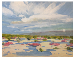
This exercise is called a color identity test. Here the student is working with paints straight from the tube, unmixed. Each color is applied as a thick "chip" of paint and then thinned with linseed oil in the box below to see how the color acts as a transparent glaze and with the addition of white in the box below that. The true nature of a color is difficult to read in its pure unmixed form. Adding white or thinning the color allows us to see the temperature and "feel" of the color much easier. The pure color unmixed is said to be fully saturated. Chroma is another word that describes how bright or intense a color is.
This student color chart shows color tone gradations matching a grey scale, color wheels, and neutrals made through the use of compliments. Each "test" shows a different effect and range of tones and color saturations. Note the bottom color wheel is using the mixture of compliments to achieve neutralized tones.

This scale demonstrates the use of complimentary colors to achieve darker values. At some point, the chips will be so balanced that the color is neither one nor the other. This chip is what we would classically call mud, a color that's over-mixed with it's compliment or is too neutral to have a color identity.

This student mixing chart shows neutral gradations of various pairs of colors (generally complimentary colors).

This final student color wheel chart shows different triads. Color wheels can be made of as many colors there are tube pigments. Which red, which yellow, which blue should be used? The reality for painters is that we are dependent on pigments, not just theories of colors. Experimenting with many color wheels and many primary triads is important and closer to the truth for painters. Note the earth palette color wheel of yellow ochre, ivory black (blue) and venetian red is a much less saturated version of a traditional color wheel.

Additional information here
*Al Gury's Color For Painters is an excellent reference and resource I found to be extremely useful and have referenced here, copies can be found on amazon for as little as $8.

This exercise is called a color identity test. Here the student is working with paints straight from the tube, unmixed. Each color is applied as a thick "chip" of paint and then thinned with linseed oil in the box below to see how the color acts as a transparent glaze and with the addition of white in the box below that. The true nature of a color is difficult to read in its pure unmixed form. Adding white or thinning the color allows us to see the temperature and "feel" of the color much easier. The pure color unmixed is said to be fully saturated. Chroma is another word that describes how bright or intense a color is.

This student color chart shows color tone gradations matching a grey scale, color wheels, and neutrals made through the use of compliments. Each "test" shows a different effect and range of tones and color saturations. Note the bottom color wheel is using the mixture of compliments to achieve neutralized tones.

This scale demonstrates the use of complimentary colors to achieve darker values. At some point, the chips will be so balanced that the color is neither one nor the other. This chip is what we would classically call mud, a color that's over-mixed with it's compliment or is too neutral to have a color identity.

This student mixing chart shows neutral gradations of various pairs of colors (generally complimentary colors).

This final student color wheel chart shows different triads. Color wheels can be made of as many colors there are tube pigments. Which red, which yellow, which blue should be used? The reality for painters is that we are dependent on pigments, not just theories of colors. Experimenting with many color wheels and many primary triads is important and closer to the truth for painters. Note the earth palette color wheel of yellow ochre, ivory black (blue) and venetian red is a much less saturated version of a traditional color wheel.

Additional information here
*Al Gury's Color For Painters is an excellent reference and resource I found to be extremely useful and have referenced here, copies can be found on amazon for as little as $8.
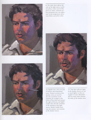
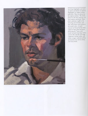
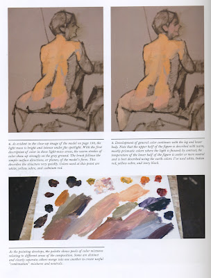
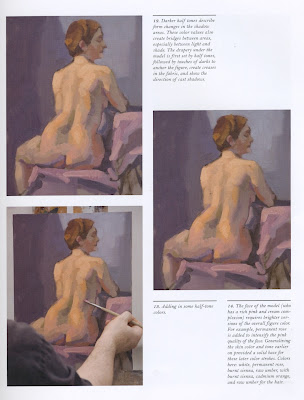
Painting Demonstrations
These tutorials should be useful for refining your figure paintings. Focus on color temperature and saturation differences to model the form and develop convincing light/shadow. Good luck!


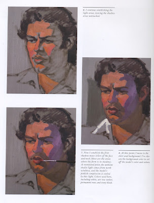


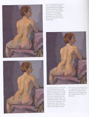
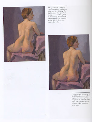
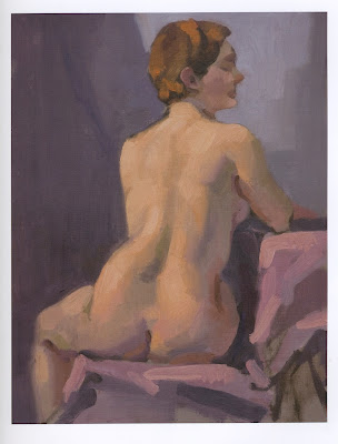
Courtesy of Al Gury's Alla Prima: A contemporary Guide to Traditional Direct Painting
Click Here for a quick read concerning blending vs. optical mixing.


Courtesy of Al Gury's Alla Prima: A contemporary Guide to Traditional Direct Painting
Click Here for a quick read concerning blending vs. optical mixing.
Monday, February 4, 2013
29th Annual High School Art Show @ The Philadelphia Sketch Club
Closing Reception
February 24th, 2013
2:00-4:00 PM
Gallery Hours:
MWF,Sat/Sun 1-5 PM

*Flyer Artwork by Capa Senior Emanuel Rodriguez. Best in Show 2012
Subscribe to:
Posts (Atom)