Wednesday, December 21, 2011

Brush Info Charts


Brush size, shape and bristle types can be a bit dizzying, especially to a young artist entering into a store. Dick Blick has these great charts that I have posted in our studio and now on here for your reference. I suggest the following sizes in flat brushes: 6,10,14,18 and the following in round: 10,16. I also suggest you purchase synthetic or taklon bristle brushes as they are versatile (can be used for watercolor, acrylic, and oil) and are extremely durable. Of course additional brushes may be picked up later to suit your needs or preferences.

Click the link to see the charts.

BRUSH SIZING
HAIRTYPE
BRUSH SHAPES

- Posted using BlogPress from my iPad

Intermediate Inspiration


Poached from the Powers of observation blog

Follow the link to view an assortment of still life paintings through art history.

Paintings by Temma Bell, Stanley Bielen, Georges Braque, Lisa Breslow, Joan Brown, Paul Cezanne, Anne Vallayer-Coster, Robert Dukes, Phyllis Floyd, Josephine Halvorson, Israel Hershberg, Chelsea James, Rebecca Kallem, Tim Kennedy, Ken Kewley, Karl Knaths, Sydney Licht, Dik F. Liu, Sangram Majumdar, Eve Mansdorf, Louisa Matthiasdottir, Ruth Miller, Piet Mondrian, Walter Murch, William Nicholson, George Nick, Andy Pankhurst, Raphaelle Peale, John F. Peto, Susannah Phillips, Fausto Pirandello, Harold Reddicliffe, Celia Reisman, Barnet Rubenstein, E. M. Saniga, Yael Scalia, Helene Schjerfbeck, Evan Tyler Stallone, Kimberly Cole Trowbridge, Euan Uglow, Peter Van Dyck, Susan Jane Walp

Grid View of Still Life Paintings

Clouds


Take a trip over to Ken Bushe's Website and look at his cloud paintings. Remember you have have 1 week to make any revisions to your final pieces once you've received your grade.

KEN BUSHE

Wednesday, December 14, 2011

Figure Drawing Materials List

The materials for charcoal drawing are few and inexpensive. Please purchase the following for our unit on Figure Drawing. All materials can be purchased at DIck Blick and Utrecht. Be sure to register for a student card if you have not to receive your 10% discount.

-VIne charcoal sticks ( purchase at least one box to start )
- Compressed charcoal (one box will last for a while)
- Kneaded eraser
- Rubber eraser
- Chamois
- Foam rubber powder puff ( used for makeup application, check target or CVS/Rite Aid)
- Sander (small wooden handled strip of sandpaper to sharpen charcoal to a point


Vine Charcoal


Compressed Charcoal

Foam rubber powder puff

sanding block

chamois

Tuesday, December 13, 2011

Color Help


An Encounter with Euan Uglow From Powers of Observation Blog-

"I had been doing the usual: chucking on the paint, wasting prodigious amounts of energy and materials. Sometimes, something would appear in this undisciplined mess, full of vitality and beauty. However it all smacked of monkeys and typewriters, and my understanding of the way painting worked was purely instinctual.

Then one day, in my last term, Euan strolled by, small and intense, dressed in black, eyes accentuated by his rather thick glasses, and told me that I didn't know what I was doing. Now usually this would have led to a fair bit of antagonism.

But on this day, like a good Zen master dealing with a stupid and recalcitrant student, Euan timed his approach perfectly, and cutting the crap, just asked me which color I thought was the most prominent when I looked at the posing model, and how light or dark I thought it was. Then, after I had mixed and applied that to the canvas, we moved to the next most prominent color, and its tone, and most importantly the relationship to the first color. And so on. Until I had filled the canvas, often with colors that seemed totally wrong but had been ascertained by their relationship to other colors.

There magically appeared on my canvas the model in all her three-dimensional glory. After some fine-tuning, it became a great little painting which I still keep as a memento to Euan Uglow in my studio. In twenty minutes, he had shown me a fundamental building block, which I was able to adapt to my own painting needs, for which I am eternally grateful.

Tai-Shan Schierenberg studied painting with Euan Uglow
at the Slade School in London."


Powers of Observation Painting Blog
Painting Perceptions
The Perect Palette
Wedding blog color boards

Wednesday, November 30, 2011

Art Journal Inspiration

*Excerpt from an interview with John Copeland about his Journals:
"Barron Storey got me started on those in 96, and I’ve been keeping them ever since. Small scale intensive sketchbooks where each page is made into a finished statement. Best part of that practice is the discipline and learning to follow through with each page till it works, experimentation and play. Anything goes in those, so you learn to play with images while working hard."


Here are several artists worth looking at to help spark some ideas for content, style, and level of craftsmanship/finish. The art journals are intended to be a place for you to spread your creative wings and experiment with materials, layering and conceptual material. Your text can be serious or as silly and simple as conversations overheard in the lunchroom. Work on several pages at once. If a piece is beginning to frustrate you, leave it and work on another. Return to those pages that frustrated you later with a fresh perspective and hopefully some new ideas/approaches to solving the visual problems they were presenting. Most importantly, have fun! This is an important part of the artists practice and will improve your work immensely.

Lapin of Doodlers Anonymous

Morgan Blair of Doodlers Anonymous

Lauren Nassef of Doodlers Anonymous

John Copeland 1

John Copeland's Full website- check the painting and drawing sections

James Jean sketchbooks- search through all of them! These are great.


Tuesday, November 29, 2011

Vocabulary


Aerial View:
Also called a bird's-eye view. Observing from a point of view at a high elevation. In perspective, when the horizon line, and thus the vanishing point (-s), have been placed near or above the top of the picture frame. This applies most often to landscapes, cityscapes, etc. (Be careful not to confuse aerial view with aerial perspective.)

Aerial/Atmospheric Perspective:
The means by which the illusion of atmospheric distance and depth is created by rendering objects in background space with less edge and value contrast. May also be accompanied by a shift from warmer to cooler hues. softer focus or lighter value.

Abstraction:
The reduction or simplification of an image or object to an essential aspect (geometric or organic) of its form or content.
Axis:
An imaginary straight line that indicates movement and the direction of movement.

Background:
Objects or undetermined spaces surrounding the main subject of a work.
The most distant zone of space in three-dimensional illusion

Backlight:
A light source positioned behind a person or object that can create a silhouette or separate the person or object from the background.

Base Tone:
The darkest tone on a form, located on that part of the surface that is turned away from rays of light.

Blind Contour:
Line drawings produced without looking at the paper. Such drawings are done to heighten the feeling for space and form and to improve eye-hand coordination

Cast Shadow:
The shadow thrown by a form onto an adjacent or nearby surface in a direction away from the light source.

Chiaroscuro:
A word borrowed from Italian ("light and shade" or "dark") referring to the modeling of volume by depicting light and shade by contrasting them boldly. This is one means of strengthening an illusion of depth on a two-dimensional surface, and was an important topic among artists of the Renaissance.

Composition:
The organization and interaction of shapes, forms, lines, patterns, light and color.

Cone of Vision:
The visual area represented by the drawing usually corresponding to a normal person’s vision , m i n u s t h e i r p e r i p h e r a l v i s i o n . ( a b o u t 6 0 degrees) A n g l e o f s i g h t .

Content:
The subject and meaning of a work of art.

Continuous Line Drawing:
A drawing in which the implement remains in uninterrupted contact with the picture plane creating enclosed shapes.

Contour:
The outline and other visible edges of a mass, figure or object.

Contour Line (Drawing):
A single line that represents the edge of a form or group of forms and suggests three-dimensional quality indicating the thickness as well as height and width of the form it describes. Contour line drawing uses subtle overlapping planes.

Convergence:
In linear perspective, parallel lines in nature appear to converge (come together) as they recede to a point on the Eye Level or Horizon Line. into the picture plane.

Cross-Contour Lines:
Multiple, curving parallel lines running over the surface of an object horizontally and/or vertically that describe its surface qualities. Much like wire framing in 3D design.

Cross Hatching:
A drawing technique to shade an object using two or more networks of parallel lines in a gradual angular progression (to achieve a build up of complex value).

Diminution:
In linear perspective, the phenomenon of more distant objects appearing smaller.

Drawing:
Depiction of shapes and forms on a surface chiefly by means of lines. Color and shading may be included. A major fine art technique in itself, drawing is the basis of all pictorial representation, and an early step in most art activities. Though an integral part of most painting, drawing is generally differentiated from painting by the dominance of line over mass.

Edge:
The rim or border, the place where two things meet: the background (negative space) meets surface of objects (positive space), a “tone” or “value” meets a different tone/value.

Eye Level:
In linear perspective, the height at which the eyes are located in relation to the ground plane. Standing creates a high eye-level while sitting creates a lower one. In most views, the eye level will match a horizon line. The same as horizon line. All vanishing points in one and two point perspective are positioned on the eye level.

Figure:
The primary or positive shape in a drawing. A shape that is noticeably separated from the background. The figure is the dominant, advancing shape in a figure/ground relationship.

Figure-Ground Relationship:
An arrangement in which positive and negative shapes alternatively command attention. Also known as a positive/negative relationship.

Foreground:
The “nearest” space represented to the viewer. The “front” of the visual stage.
An exaggeration of perspective in which elements nearer to the viewer are shown much larger, and elements at a distance appear much reduced in size.

Foreshortening:
A technique for producing the illusion of an object’s extension into space by contracting its form. A way of representing a subject or an object so that it conveys the illusion of depth -- so that it seems to go back into space.

Freehand Drawing:
Drawn by hand, without the use of any mechanical device -- without the aid of a straightedge, compass, protractor, French curves, computer equipment, etc. This is the opposite of mechanical drawing.

Gestalt:
A total mental picture, or conception, of a form.

Gradation:
Any gradual transition from one tone to another. In drawing, shading through gradation can be used to suggest three-dimensional illusion.

Gesture:
A spontaneous representation of the dominant physical and expressive stance of an object. The act of making a sketch with relatively loose arm movements (gestures) -- with the large muscles of the arm, rather than with the small muscles of the hand and wrist; Or a drawing made this way.

Grid:
A framework or pattern of criss-crossed or parallel lines. A lattice. When criss-crossed, lines are usually horizontal and vertical; and when lines are diagonal, they are usually at
right angles to each other.

Ground:
The actual flat surface of a drawing, synonymous with a drawing’s opaque picture plane. In a three dimensional illusion, ground also refers to the area behind an object (or figure).

Half Tone:
After the highlight and quarter tone, the next brightest area of illumination on a form. The halftone is located on that part of the surface that is parallel to the rays of light.

Highlight:
The brightest area of illumination on a form, which appears on that part of the surface most perpendicular to the light source.

Horizon Line:
In linear perspective, the line on which all vanishing points are positioned. More accurately described as the eye line or eye level.

Layout:
The placement of images within a two dimensional format.

Light Tone:
After highlight, the next light value of illumination on a form. Sometimes called indirect light.

Line:
A mark with length and direction. An element of art which refers to the continuous mark made on some surface by a moving point. Types of line include: vertical, horizontal, diagonal, straight or ruled, curved, bent, angular, thin, thick or wide, interrupted (dotted, dashed, broken, etc.), blurred or fuzzy, controlled, freehand, parallel, hatching, meandering, and spiraling. Often it defines a space, and may create an outline or contour, define a silhouette; create patterns, or movement, and the illusion of mass or volume. It may be two-dimensional (as with pencil on paper) three-dimensional (as with wire) or implied (the edge of a shape or form).

Line gesture:
A type of gesture drawing that describes interior forms, utilizing line rather than mass.

Local Value:
The basic tonality of an object’s surface. regardless of incidental lighting effects or surface texture.

Mark:
A visible trace or impression on a surface, such as a line, a dot, spot, stain, scratch, etc.

Mass:
The density or weight of an object.

Massing:
In composition: to block-in forms with the purpose of achieving an overall organization of visual weight.

Mass gesture:
A system of broad, gestural marks used to create density and weight in a form.

Middle ground:
The area between the foreground and background in a drawing.

Modeled Drawing:
A method of drawing which delineates form through the use of a variety of values-A range of tones from light to dark.

Motion:
The arrangement of the parts of an image to create a sense of movement by using lines, shapes, forms, and textures that causes the eye to move over the work.

Negative Space:
The space surrounding a positive shape; sometimes referred to as a ground, empty space, field, etc.

Outline:
A line of uniform thickness, tone and speed, which serves as a boundary between a shape or form and its environment. It does not suggest contour, and is therefore flat, two dimensional. A silhouette.

Overlapping Planes:
A method of representing hierarchy of space in a drawing. Overlapping occurs when one object obscures from view part of a second object.

Planar Analysis:
A structural description of a form in which its complex curves are generalized into major planar zones.

Perspective:
Any system used to represent depth or space on a flat surface by reducing the size and placement of elements to suggest that they are further away from the viewer.

One-Point Perspective:
A frontal, head on view with a central point at eye level at which all receding parallels appear to converge and vanish.

Two-Point Perspective:
A way of representing space on the picture plane in which physically parallel elements of the same size appear progressively reduced along converging rays to the left and right, reaching a single point on the horizon on both the left and right side.

Three Point-Perspective:
A system for representing objects in space with exaggerated three dimensionality, through the use of three perpendicular sets of converging parallels.

Picture Frame:
The physical vertical and horizontal dimensions of the paper surface.

Picture Plane:
The flat, two-dimensional surface on which a drawing is made.

Plane:
Any flat level or surface.

Plastic:
Denotes the illusion of three dimensionality or movement into the picture plane as it relates to the flat, two-dimensional nature of the picture plane itself. We refer to this as plastic space in contrast to perspective space.

Positive Space:
The shape of an object that serves as the subject for a drawing. The relationship between positive shape and negative space is sometimes called figure/ground, foreground/background relationship.

Proportion:
A term that refers to the “accurate” relationship of part to part in a realistic drawing. It can also refer to the expressive purposes, e.g. Distortion of proportion to consciously or unconsciously achieve a subjective intention. Proportion also relates to a sense of balance.

Reflective Light:
The relatively weak light that bounces off a nearby surface onto the shadowed side of a form.

Relative Scale:
A way in which to represent and judge the spatial position of an object in three-dimensional illusionistic space so that forms drawn smaller appear further away and forms that are drawn larger appear closer.

Representational:
A drawing that attempts to achieve a near-likeness to the objects being drawn. Drawings which strive to achieve the qualities of realism.

Rendering:
A depiction or an interpretation. Also, a drawing in perspective of a proposed structure. (Rendering can be used either as a noun or as a verb.)

Scale:
A ratio or proportion used in determining the dimensional relationship between a representation to that which it represents (its actual size), such as maps, building plans, and models.

Shallow Space:
A relatively flat space, having weight and width but limited depth.

Shape:
A contained, edged-in area on the two-dimensional surface. Or an area that suggests containment. A shape is always interdependent with another element (shape or space) in the composition.
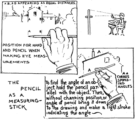
Sighting:
The visual measurements of objects and spaces between objects.

Silhouette:
Any dark two-dimensional shape seen against a light background.

Sketch:
A quick drawing that loosely captures the appearance or action of a place or situation. Sketches are often done in preparation for larger, more detailed works of art.

Space:
The distance between images or points in a drawing. We contain space when defining edges of interrelated shapes.

Station Point:
In linear perspective, the fixed position a person occupies in relation to the subject that is being drawn.

Surface:
The actual physical structure or texture of the drawing paper containing degrees of smoothness, gloss, or roughness.

Texture:
The actual or suggestive surface quality of a two-dimensional shape or three-dimensional volume. Texture can be created by using skillful drawing techniques, erasure, rubbing, or employing specific materials such as sand.

Two Dimensional Space:
The flat, actual surface area of a drawing, which is the product of the length times the width of the drawing paper support.

Three Dimensional Space:
The actual space in the environment, and the representation of it in the form of pictorial illusion.

Value:
Black, white and the gradations of gray tones between them. The relative degree of light and dark.

Value Relativity:
The changing visual identity of values in juxtaposition, sometimes called value contrast.

Value Scale:
The gradual range from white through gray to black.

Value Pattern:
The arrangement or organization of values that control compositional movement and create a unifying effect throughout a work of art.

Visual Weight:
The potential of any element or area of a drawing to attract the eye.

Volume:
The overall size of an object, and by extension the quantity of three-dimensional space it occupies.

Wednesday, November 23, 2011

Thiebaud X Morandi


I found a great little interview with Wayne Thiebaud discussing his work/process and the influence of artist Giorgio Morandi's work.

OBJECT LESSONS

"An exhibition of the works of Wayne Thiebaud was held recently at the Museo Morandi in Bologna, Italy, alongside Giorgio Morandi’s oeuvre. The show was curated by Alessia Masi in collaboration with Carla Crawford. Masi interviewed Thiebaud for the show’s catalogue. Following are excerpts of their conversation:

Alessia Masi: You have claimed Morandi as a personal influence in your work. What are your reactions to your dialogue with Morandi?

Wayne Thiebaud: I’ll see if I can focus on some main things. There are such good lessons to learn from looking at his work. They have to do with certain propositions that I think serious painters need to be aware of. One of them, I think, is the wonder of intimacy and the love of long looking. Of staring but at the same time moving the eye, finding out what’s really there, and there are so many things that are subtle and may look like something at one moment but not the next. There’s always that kind of “not quite” with Morandi and yet the feeling of totality is so nicely complete. It’s always a joy to look at his work. He also cautions us painters against the idea of over doing. It’s alright to have drama but not melodrama. So many good lessons.

AM: When did you first see Morandi’s work? Was it love at first sight or an acquired taste?

WT: Well he was hard to see here in America for such a long time and I’m so damned old that people have trouble remembering that it really was very difficult to find his work in exhibitions. But once you got a little taste of seeing one or two you found they were really interesting puzzles. I suppose I would say I was slow to appreciate them. At first it looked like they were hardly focused, that they were sort of scruffy and somewhat inept. We were used to American bravura and the way in which Americans tend to be a little over the top and striking out for attention. These didn’t come to you, you had to go to them.

AM: Your careful study of light on the form plays a strong role in your paintings. Like in Morandi’s work, the light seems to come from inside your paintings themselves, while they take shape, a sort of luminous energy. Could you comment on the role of light in your paintings?

WT: Well I think we’re talking about a very interesting duality about light and the use of light in painting. One category has to do with the formal properties of light and imitating it, that is to say, of knowing what a highlight is, a cast shadow, a reflected light and so on, and then replicating that or using that strategically as a way of determining volume. So in a sense you’re showing how light works by specific annotation. The other kind of light however is quite a different tradition, that’s where, as you indicated with your reference to Morandi, the light is created by way of creating energy, by the juxtaposition of colors and the interaction of those colors to create light quite different from the modulation of volumetric rendering. If we look at Bonnard, or Matisse, or Vuillard, that tradition, the wonder of it is the way the light comes off the paper by way of color. It’s not what we refer to as natural light, but it’s a kind of eternal light, or symbolic light, or light that is sustained by the energy of the interaction of color.

AM: We know that Morandi had an almost ritualistic way of finding the right composition for his paintings. He would place various objects on the tables in his study and work with each of them until he was satisfied with their positions. He would then mark the paper beneath the objects with a pencil. He would do the same for his own feet on the floor so that he would be able to find that “unique point of view” again. Can you relate to this meticulous search for the right composition in your own work?

WT: I can, because I’ve read so many instances of painters, all the way from Morandi through many others who are fascinated by it. The most ridiculous one, I think, was Ingres, who loved to tie threads on all those draperies and pin them in such a way that the point of tension every time that he restructured his subject was back to exactly the same marks. So the idea of structural development, Morandi does it that way. Mondrian made thousands of little thumbnail drawings. Sometimes he could make as many as a hundred little three inch by two inch or four inch by five inch drawings of placements for a particular piece. Where the lines would intersect, how much space in one area as opposed to another. This was one of the things I got out of the old art directors who always had you make lots of tiny little compositions before you made a large one. I’ve been taught that in my teaching experience as well, to try to have students get so they’re always trying for one more variation of what they’re looking at rather than getting too early cast in concrete, getting a composition that doesn’t work—it’s too heavy on the right or it’s not coherent—or whatever. This testing out different set ups is one of very basic needs of any serious artist. Watching de Kooning work as I had a privilege to do or working with Diebenkorn and seeing how long he would look and slightly move things or re-draw. I think, the whole idea of collage was developed because you’re blotting out an area you don’t want which re-establishes the plain and then being able to go back and make adjustments. So yes, I think that certainly attention to composition is a mark of anyone who’s serious about it. It’s probably a pretty neurotic activity, but that’s what it is.

AM: How do you work in terms of reference in your own studio. Do you work from life? From memory or imagination? Do you ever use photographs as reference?

WT: Mostly a lot of drawing, a lot of painting, a lot of reading. I read a lot of poetry. I cannot use photographs. I have a kind of quarrel with them. I don’t like them very much. It’s such a different world from painting. . . . So when you look at, say, Vermeer who everyone talks about being photographic, and if you’re thinking that you’re doubting Vermeer as a painter, you’re missing what looks almost like salt crystals for focus, little scattered points of light, almost pointillism, and then these curious and difficult edges that are almost impossible to find. You think you can, you keep looking but it’s very hard to determine whether that’s the background or the object or the arm. I find that extraordinary. Also, all you have to do is cut a hole in a piece of eight-in-a-half by eleven paper about the size of a dime and put it on any part of a Vermeer painting and you say, “yep, that’s Vermeer. That’s not a photograph.” But you can also do that with great stylists of any kind. Oh yeah that’s a Seurat, that’s a Picasso, this is a Derain, this is a Degas, this is a so-and-so. Just through that little coin-like opening. So you have to draw a lot, you look a lot, you learn to see more carefully than people usually see and remember that lesson that Ingres gave his students of the gray scale. He told his students that he wanted them to make a gray scale from white to black and that he wanted to be able to see that each step of these hundred little squares that they were going to paint was a marvelous transition from black to white. The students rebelled and said “ah, you crazy old son of a so-and-so. I can’t see that many!” And they tried like mad, he’d go on and say, “oh number 38 is the same as 37. You’ve got to make that nuance change!” So they rebelled and gave him hell and stopped working. So he brought out his own student project of the same kind and it had a thousand steps! Now you think he’s lying, until you look at the back of that Turkish bather, what beautiful subtle values!

AM: On September 27, 2010, Google, the world’s most popular search engine, celebrated its 12th anniversary with a digital image of their logo written on a Thiebaud birthday cake. Have you ever entered “Thiebaud” in a search engine? If so, what did you think of the results?

WT: Oh, not much. I don’t really like to look at my own paintings, so we hang other people’s works and I’m not much interested in looking at my own. There’s always something wrong with the damn things! Or I want to get up and work on them. I often like to get rid of them actually. I’m afraid I’ve become a little bit self-conscious."

Poached from Artnews.com here
http://www.artnews.com/2011/11/08/object-lessons/


-

Video link below
http://www.youtube.com/watch?v=vI_QJ5D9Qm8&feature=youtube_gdata_player

Posted using BlogPress from my iPad

Monday, November 14, 2011

2nd Marking Period Homework


________________________________________________________________________________
9th Grade Foundation

Still Life Arrangements

Complete the following in your sketchbooks.

Note:
A. All objects must have obvious highlight and shadow. Please include cast shadows when they are present.
B. All images must fill the page.
C. When showing more than one object in a composition, the objects must overlap.

1. A bathrobe, nightgown, or pajamas hanging on a hook or doorknob.
2. An arrangement of three pots and pans of various sizes.
3. A group of three toys of different sizes.
4. A view of an umbrella (opened), resting on the floor, upside down.

Figure Drawing: The following clothed figures are to be rendered in 4B, graphite pencil. You must include evidence of an obvious light source and appropriate values for describing the horizontal and vertical space around the figure. All figures are to fill the page and be in 3/4 view. All figures must be drawn from life, no photographs.

5. A standing figure
6. A figure sitting on a stool
7. A figure reclining on a sofa, bed, or floor
8. A figure squatting
9. A figure leaning against a wall
10. A figure leaning over to pick something up.

The drawings will be evaluated on:
a. Accuracy of proportion
b. gesture
c. view
d. highlight and shadow
e. vertical and horizontal space

ALL SKETCHBOOK WORK FOR FRESHMEN DUE: WEDNESDAY JANUARY 18TH
________________________________________________________________________________

10th Grade Intermediate

Still Life Arrangements

Complete the following in your sketchbooks.

Note:
A. All objects must have obvious highlight and shadow. Please include cast shadows when they are present.
B. All images must fill the page.
C. When showing more than one object in a composition, the objects must overlap.

1. A stove with two pots
2. Two or more trash cans/recycling bins, one with it's lid propped against it
3. A group of three books, one opened
4. A bicycle in three-quarter view
5. A three-quarter view of a computer and it's keyboard

ALL SKETCHBOOK WORK FOR SOPHOMORES DUE: TUESDAY JANUARY 24TH

Special Project

Subject- A cluttered interior corner of any room in the house. ( kitchen, bathroom, bedroom, tv room, garage, etc.)
Size - 18 X 24 inches
Medium- Any color medium, wet or dry (pastels, oil chalks, markers, colored pencils, watercolors, acrylics )
Requirements:
- Must show two walls ( but not equally )
- Must contain a lot of objects
- Must be viewed above or below eye level
- Must show an obvious light source

* Sketches for final piece may be completed in your sketchbook.
B/W Sketches Due: Wednesday November 30th
Color Sketches due: Wednesday December 14th
Final Piece is due: January 12th

________________________________________________________________________________

11th/12th Grade Advanced

1. CLOUD SKYSCAPE

- You are to depict a landscape or cityscape where the CLOUD-FILLED SKY commands MORE THAN 50% OF THE COMPOSITION.
- Naturally, you must include FOREGROUND AND MIDDLE GROUND (and BACKGROUND where applicable).
- You may employ any point of view while AVOIDING PARRALLEL SPACE AND A BULL'S EYE COMPOSITION (DEAD CENTER COMP.)
- TIME OF DAY and the accompanying Light Source must be obvious.
- Your COLORS will reflect the time of day depicted.
- Any color medium, wet or dry (pastels, oil chalks, markers, colored pencils, watercolors, acrylics, oils, etc. )

The pieces will be evaluated on:
- Composition
- Depiction of Space
- Light
- Use of color
- Craftsmanship

B&W sketch Due: Tuesday Novermber 29th
Color Sketch Due: Tuesday December 6th
Final Piece Due: Tuesday December 20th

3. FIGURE IN SPACE

SUBJECT: You are to capture in mid gesture, a figure in deep space. The space is the actual place where the figure's action is taking place.
- Your figure will be in the middle ground, which allows us to see the entire figure surrounded by foreground and background objects.
- The figure must be in three-quarter view
- You will view this figure in it's space above or below eye level.
- Your view will demonstrate a strong, direct light source.

SIZE: 18 x 24 inches

MEDIUM: Oil or Acrylic Paint

The pieces will be evaluated on:
- Composition
- Accuracy of proportion
- Depiction of Space
- Light
- Use of color
- Gesture
- Craftsmanship

B&W sketch Due: Thursday December 22nd
Color Sketch Due: Wednesday January 4th
Final Piece Due: Tuesday January 19th

4. ART JOURNAL
Your personal ARTISTIC journal is your daily record of your thoughts, realizations, concerns, hopes, fears and reactions to any event in your private or public life.
What will distinguish this journal from all others is the ARTISTIC way you are going to combine your PICTORIAL and VERBAL "notes". They will be integrated within a "single" or a "double page spread" in such a way that one cannot be successfully separated from the other. Your text may be painted or printed but it must be INTEGRATED into the visual concept of the page as a visual balance of the page is what you wish to achieve.
You are required to submit a minimum of 20 pages in full color using a mix of media.

Final Due Date: Monday January 23rd 2012

________________________________________________________________________________

Thursday, November 10, 2011

The Importance of Value in Painting

I found the following images on Anne Kullaf's Blog Loosen Up. It is an excellent example of underpainting and the development of a painting.
This first image shows an incomplete underpainting that resolves issues of proportion, and begins to address value. This underpainting was done using a tinted ground (gesso and some light red ochre) and burnt umber. The values are beginning to be established by the use of washes to block in medium and light values and an undiluted application will block in the darker values.


Notice in this slide the underpainting is blocking in the rest of the background information. Underpaintings are meant to establish a firm structure for your painting but do not need to be resolved and finished in the same way that a finished painting is finished. Notice how loose and gestural the figures and marks are.


This slide illustrates the initial blocking in of color. Notice that we are working with large simple blocks of color or shape, always work from large simple shapes down to smaller more complex shapes. Resist the urge to jump into details.


More color is being introduced. Notice that the artist is starting to work into smaller shapes and that some areas of the underpainting are showing through. You do not have to always use a neutral color but you can see here why it may be helpful because it is harmonious with the palette being used. Imagine if the preliminary underpainting was completed in a bright red or neon green and imagine the effect that might have.


The artist is continuing to refine the painting and developing a nice range of values by mixing tints tones and shades of color. Edges are being cleaned up and objects are brought to a higher level of clarity.


This is the finalized painting. At this point the artist has provided "eye candy" using fully saturated jewel like colors to add details like the lettering in the sign for the restaurant.


This is a detail of one of the figures in this painting. This is a wonderful example that sometimes less is more. The face of this figure is merely suggested through tonal variation as opposed to being meticulously rendered. As an artist you will have to make decisions about how much information to supply the viewer. This is an extremely useful tool to guide the viewers eye around your work.

Wednesday, November 9, 2011

NBC LEARN


Take a minute to register with NBC Learn HERE

Use the registration code: IWU5AL

Wednesday, November 2, 2011

Advanced Class (11th/12th Grade) Color Theory Fundamentals

Since we will be spending the entire month of November studying oil painting it is crucial we have a firm understanding of the basics of color theory and how that applies to mixing color. This is a traditional color wheel showing the pure color (also referred to as hue). You will see that each color is then tinted with the addition of white, toned with the addition of grey and shaded with the addition of black. This is the most simple way to control value with color, note that an even greater range of tones is possible by mixing more ore less white, grey or black accordingly.


This exercise is called a color identity test. Here the student is working with paints straight from the tube, unmixed. Each color is applied as a thick "chip" of paint and then thinned with linseed oil in the box below to see how the color acts as a transparent glaze and with the addition of white in the box below that. The true nature of a color is difficult to read in its pure unmixed form. Adding white or thinning the color allows us to see the temperature and "feel" of the color much easier. The pure color unmixed is said to be fully saturated. Chroma is another word that describes how bright or intense a color is.


This student color chart shows color tone gradations matching a grey scale, color wheels, and neutrals made through the use of compliments. Each "test" shows a different effect and range of tones and color saturations. Note the bottom color wheel is using the mixture of compliments to achieve neutralized tones.


This scale demonstrates the use of complimentary colors to achieve darker values. At some point, the chips will be so balanced that the color is neither one nor the other. This chip is what we would classically call mud, a color that's over-mixed with it's compliment or is too neutral to have a color identity.


This student mixing chart shows neutral gradations of various pairs of colors (generally complimentary colors).


This final student color wheel chart shows different triads. Color wheels can be made of as many colors there are tube pigments. Which red, which yellow, which blue should be used? The reality for painters is that we are dependent on pigments, not just theories of colors. Experimenting with many color wheels and many primary triads is important and closer to the truth for painters. Note the earth palette color wheel of yellow ochre, ivory black (blue) and venetian red is a much less saturated version of a traditional color wheel.


Additional information here

*Al Gury's Color For Painters is an excellent reference and resource I found to be extremely useful and have referenced here, copies can be found on amazon for as little as $8.

Friday, October 28, 2011

Foundation HW (9th Grade)

DUE FRIDAY NOVEMBER 4TH


Complete the following in your sketchbook:

1. A grouping of three books, one opened. Pay close attention to the angles created by the edges of the books.

2. An arrangement of a cup and a saucer, and a sugar bowl. If you do not have these a cup, small plate and a small bowl will suffice. Remember to have objects overlap, not kissing one another or the edge of your paper

*NOTE:
- All objects must have obvious highlight and shadow. Please include cast shadows when they are present.
-All images must fill page.
- When showing more than one object in a composition, the objects must overlap.
- If your sketchbook is smaller than 8.5" x 11" complete each drawing as a two page spread to allow you enough room to develop your drawing.
- Give yourself adequate time to work on your drawings... doing them the night before will most likely result in a rushed, incomplete or under developed drawing and a poor grade.

Intermediate HW (10th Grade)


DUE FRIDAY NOVEMBER 4TH:

Complete the following in your sketchbook:

1. A group of two chairs, a table, and a lamp. Make sure you check your angles and proportions to achieve convincing perspective and a believable space. You may also refer to your composition notes for tips to achieve depth.

2. A dishrack with two dishes and a cup or glass. Pay close attention to the reflected light and the values seen through the glass.

*NOTE:
- All objects must have obvious highlight and shadow. Please include cast shadows when they are present.
-All images must fill page.
- When showing more than one object in a composition, the objects must overlap.
- If your sketchbook is smaller than 8.5" x 11" complete each drawing as a two page spread to allow you enough room to develop your drawing.

Thursday, October 27, 2011

Sighting Review


*Poached from MCC Drawing Blog

"You can estimate proportions and then check them with a fair degree of accuracy by employing what is called the thumb-and-pencil method of finding proportions. This is done by simply placing your pencil or pen in your hand and then holding it at arms length between your eye and the object that you plan to draw. Here is how:


(1) Hold your body rigid and extend your dominant arm (usually the right arm), pencil in your hand, to its full length.
(2) Place your thumb against the pencil as a gauge (sliding it up and down or to the left or the right, depending on the unit of measurement you wish to establish).

(3)Bring the pencil on a line with your eye and the object that you are measuring.
(4) Try to find one part by which you can then measure the rest of the object. In the diagram above, the head is used as a unit of measurement to determine the length of the subject's body. This is done by aligning the tip of the pencil with the edge of the snout, and the thumb is resting on the pencil to where the head ends at the start of the neck. The tiger above is thus, six heads in length.

(5) Once you find a part to which to measure the rest of the parts of the object, you can then proceed to put in the object’s details, still using the same scale of measurement in which you established.


An example of how to use your pencil as a measuring stick to find the height and width of the house with the use of your pencil and thumb. You can also find the angle of the roof with this method. In drawing the house (as shown above), the height of the chimney might be taken as a standard of measurement. Hold the pencil upright, the top on a line with the chimney top. Now move the thumb downwards until the end of your thumb comes between your eye and the bottom of the chimney. Then draw the chimney. Repeat this measuring operation, finding where the length of the chimney corresponds to other parts of the house. Your pencil can be moved between the house and your eye and by using the chimney length as your standard of measurement, the corresponding length and width of the house can be estimated.

With the pencil and thumb measuring technique, you can even find the angle of an object, such as the house’s roof. Just hold your pencil parallel with the object (in this case the roof). Then, without changing the position or angle of your pencil, just bring it down to your paper and make a light stroke indicating the angle.


Likewise, by sliding the pencil up or down so as to increase or decrease its length between the points ‘a’ and ‘b’, (shown above) you will be able to check the height of an object as shown below. The same principle applies for heights and lengths/widths.


Above is a demonstration of the height of a cone being checked, while the bottom demonstrates the width of the cone being checked.

This thumb-and-pencil method of checking is easy to understand once you experiment with it. Be sure, however, that you do not change your position or distance from the model once you have started to check, since distance and position change the appearance and size of any object under study."